Two separate photos. Please let me know what you think, went with a whole new idea with this one. Indulgence in the first one, & too pretty to eat in the second.
I'm really feeling the second one, its a different approach and i like it!.. the only thing that is bothering me is the way her right hand is cut off.. maybe try pulling back a little bit, but still keep her and the donut off center ?:) other the that GREAT WORK! :)
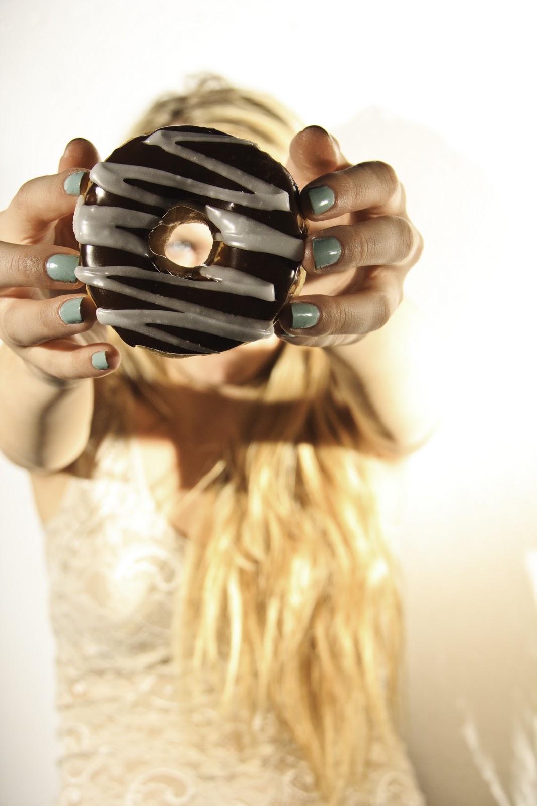
I'm not sure either photograph is working but the second is stronger than the first. It reads like a fashion photograph and the emphasis is on the colour, shapes and design found in the donut and her nails. For this reason you need to play that up more. It is not colour balanced (too yellow), and the donut is too dark. You could re-crop or re-design with an emphasis on the donut and nails. That all being said the concept is still relatively weak.

I'm really feeling the second one, its a different approach and i like it!.. the only thing that is bothering me is the way her right hand is cut off.. maybe try pulling back a little bit, but still keep her and the donut off center ?:) other the that GREAT WORK! :)
ReplyDeleteI'm not sure either photograph is working but the second is stronger than the first. It reads like a fashion photograph and the emphasis is on the colour, shapes and design found in the donut and her nails. For this reason you need to play that up more. It is not colour balanced (too yellow), and the donut is too dark. You could re-crop or re-design with an emphasis on the donut and nails. That all being said the concept is still relatively weak.
ReplyDelete-Robyn