Wednesday, 29 February 2012
Fern Kachuck, Theme #2: High School (oops forgot to write that..)
I give you, The Anne and Max Tanenbaum Community Hebrew Academy of Toronto Raoul Wallenberg Campus. There's a shit ton I could say about my high school, as many can. Both bad and good. I wish I could say that I hated my high school.. However, I realized late into grade 12 that there was no other high school I would have rather gone to. BUT, the administration and politics of my high school were absolutely fucked up. Pretty much all I got out of it was that it really wasn't worth my parents paying over 20,000 a year to send me to a place where if you didn't become another jewish doctor or lawyer, they hated you. And my principal made it pretty known she didn't like me.
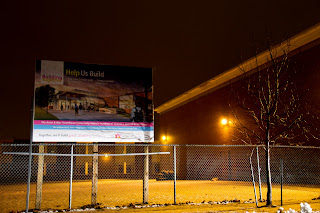
The picture I took is of a sign I saw the other day when I went back to visit my old art teacher. Its a sign that says "Help Us Build." CHAT wants to build a new science wing and needs your money! Its just pretty much the epitome of CHAT, taking your money to further the real academics, never the arts. I think I like the first one better.. Thoughts?
Subscribe to:
Post Comments (Atom)


Great idea Fern! I think its a very relate able subject, I can definitely say my high school was also not as fond of the arts over other subjects.
ReplyDeleteAnd I definitely like the first one more! I like how it kind of looks as if there is a spotlight on the sign, adds to the image.
- Alycia
You can play a lot with this idea. Although I don't know what a straight on shot of this sign will do...maybe another element added to re-enforce the backstory? Technically, the second photo is blurry. The first one is fine, but the lighting really takes your attention to just below the sign instead of on it. If there isn't a significance to shooting at night, try it in the day time!
ReplyDelete- L
i don't mind the shot, but i don't like either of the crops. maybe a crop thats somewhere in between? closer than the first but not as close as the second? as for lighting, i wish that more of the sign were lit, not the stuff below it (e.g. ground, snow etc) this way its like you are shining a light (physically) on the issue - nice concept though, but i think a quick reshoot could help you execute it better
ReplyDeleteI think the first image works really well but the only thing thats bothering me is the yellowy tint everything is. Im not sure if that was your intention but if not you could maybe play around with the colour temp in photoshop or lightroom!
ReplyDeleteSTEF
Fern
ReplyDeleteAt this point your photographs do not reflect the story. Without your explanation it is just a very boring photograph of a very uninteresting looking sign.
-Robyn